Birdbird


About
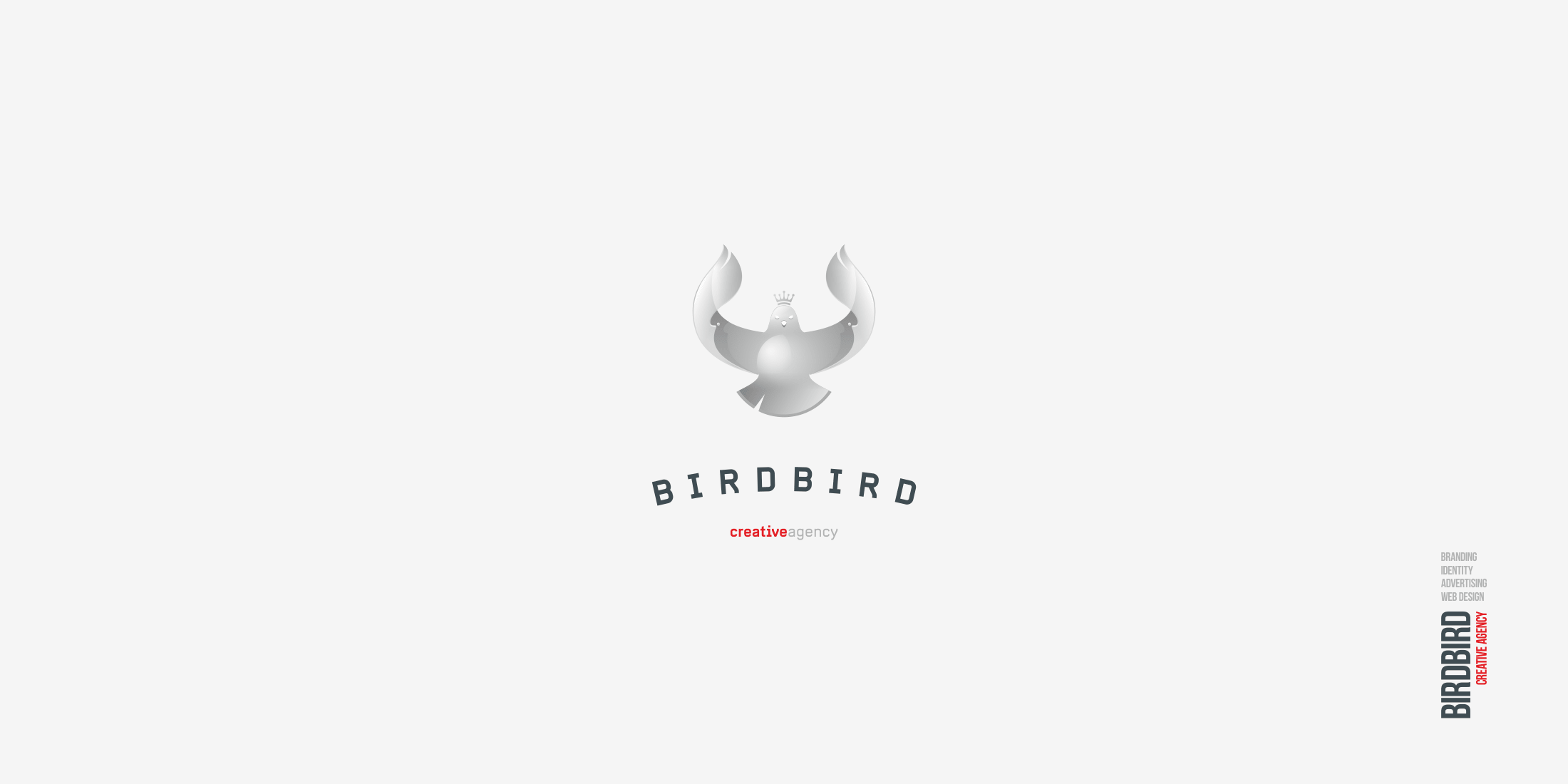
Birdbird is a creative agency specializing in identity, production of outdoor advertisements and developments in the IT field.
A bird can be big, and can be small...
It can be wild or domestic, predatory or granivorous...
Our bird must be bright, noticeable and unique. Our bird should be a high-flying bird. Exactly the same as the brand itself and what it produces. That is precisely the idea behind the concept of the Birdbird logo.
For each field of activity for the agency, was developed its own color version of the logo with the appropriate color scheme of each direction.
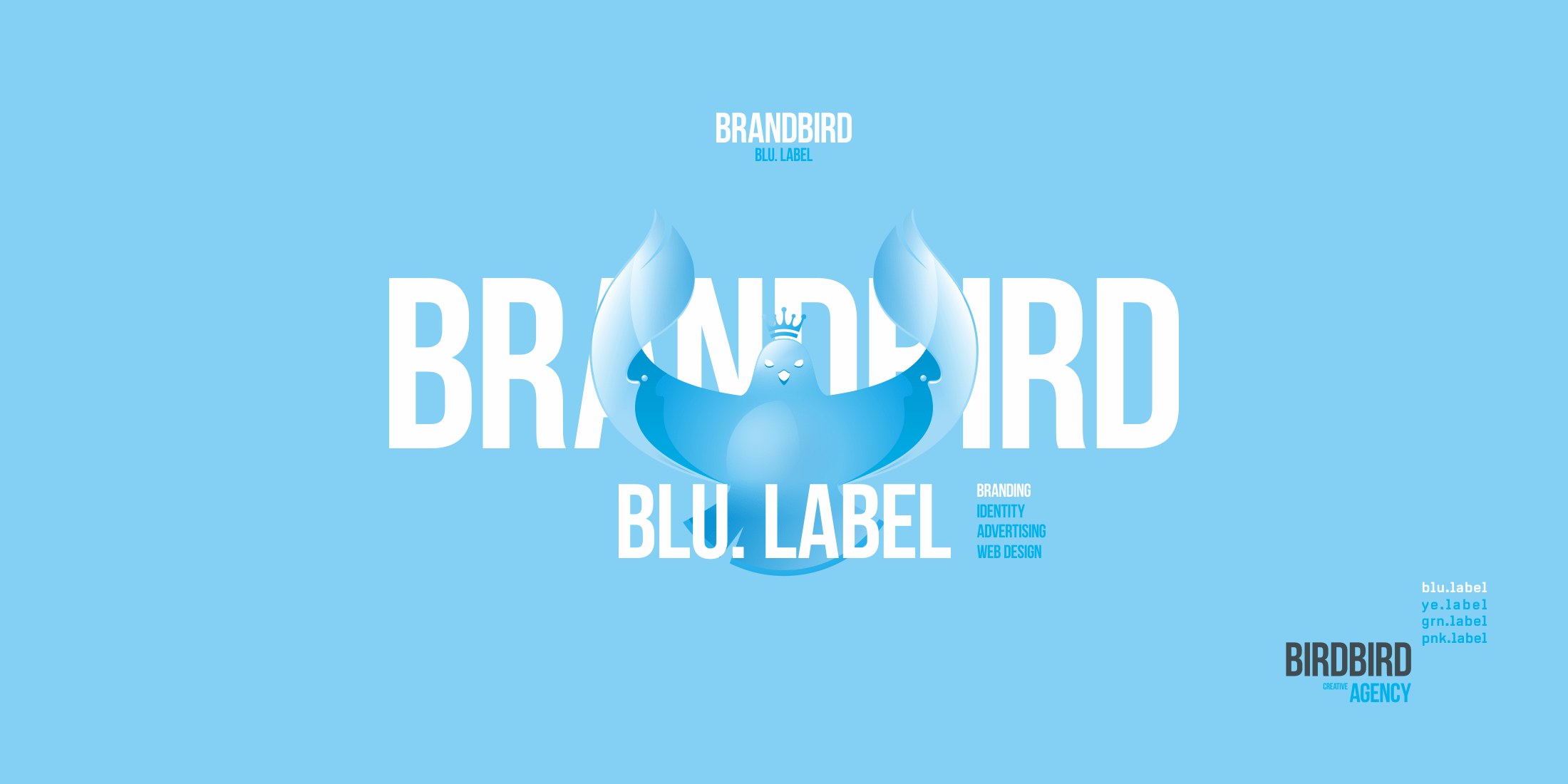
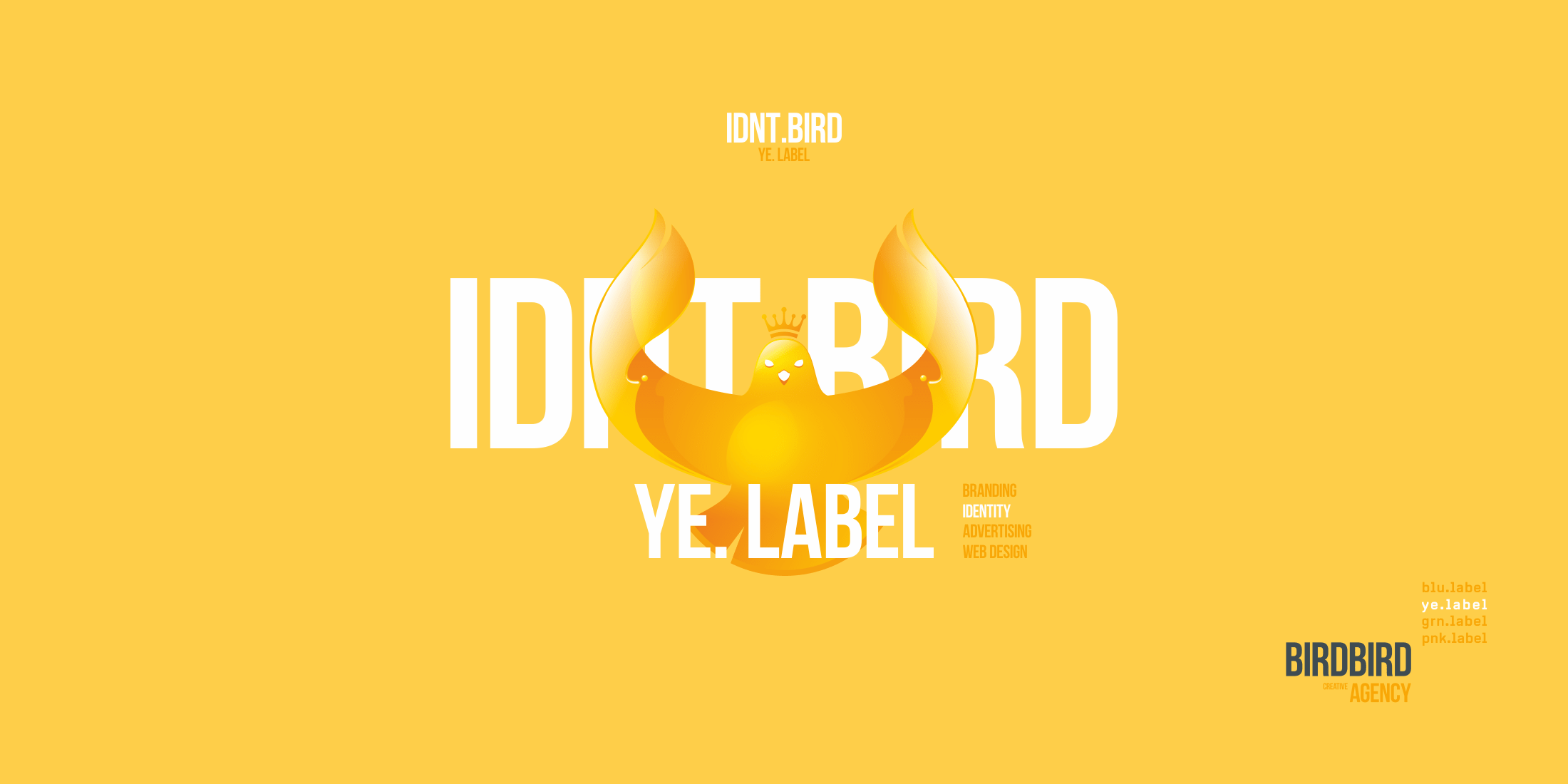
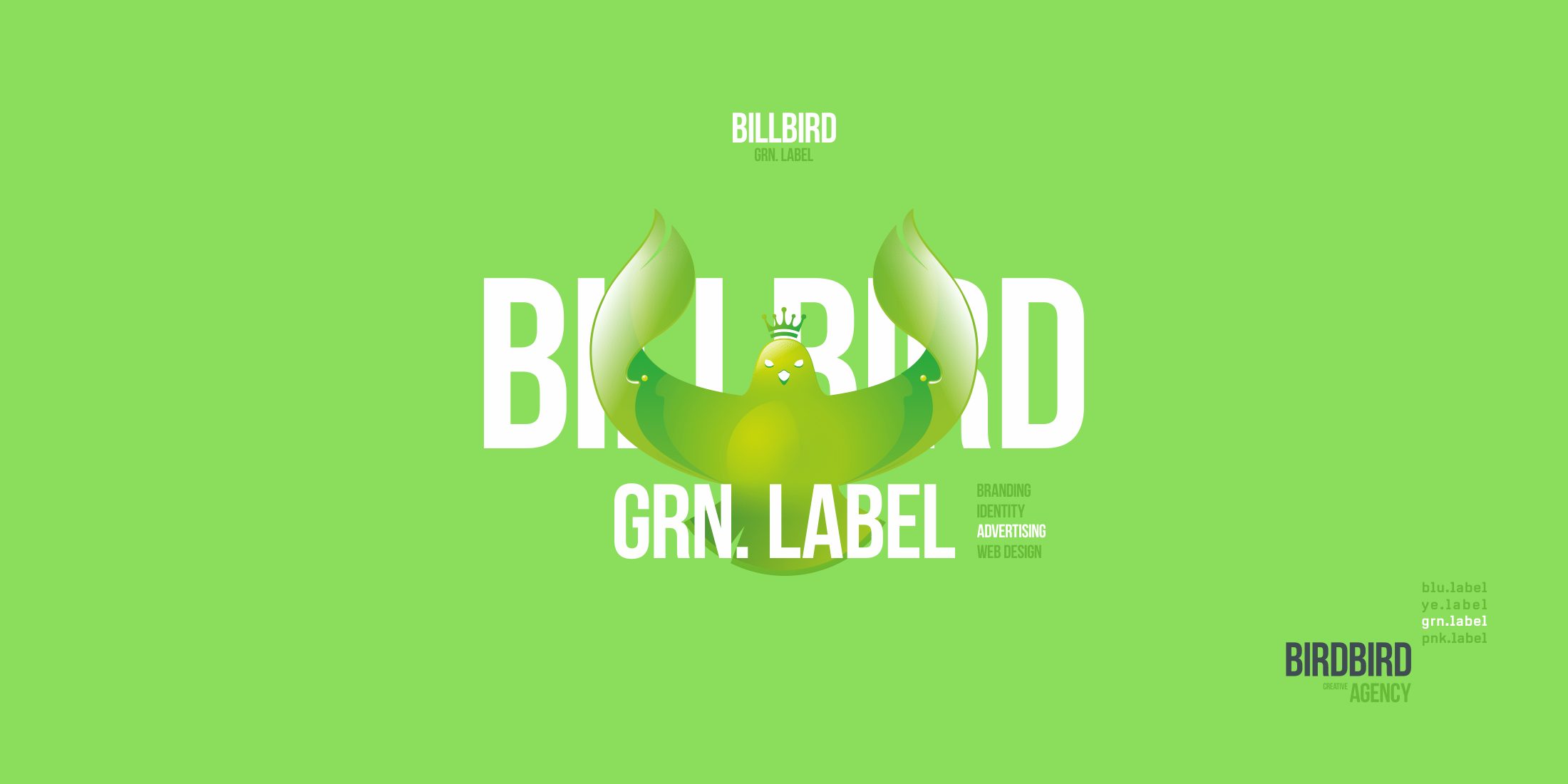
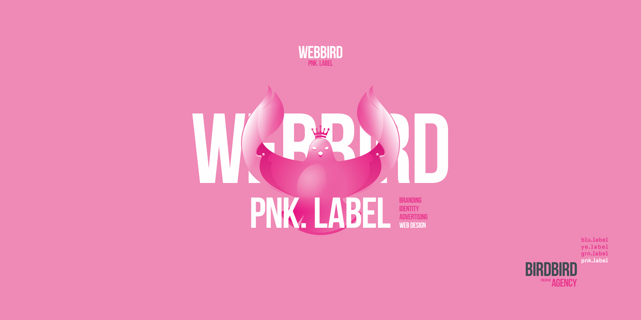
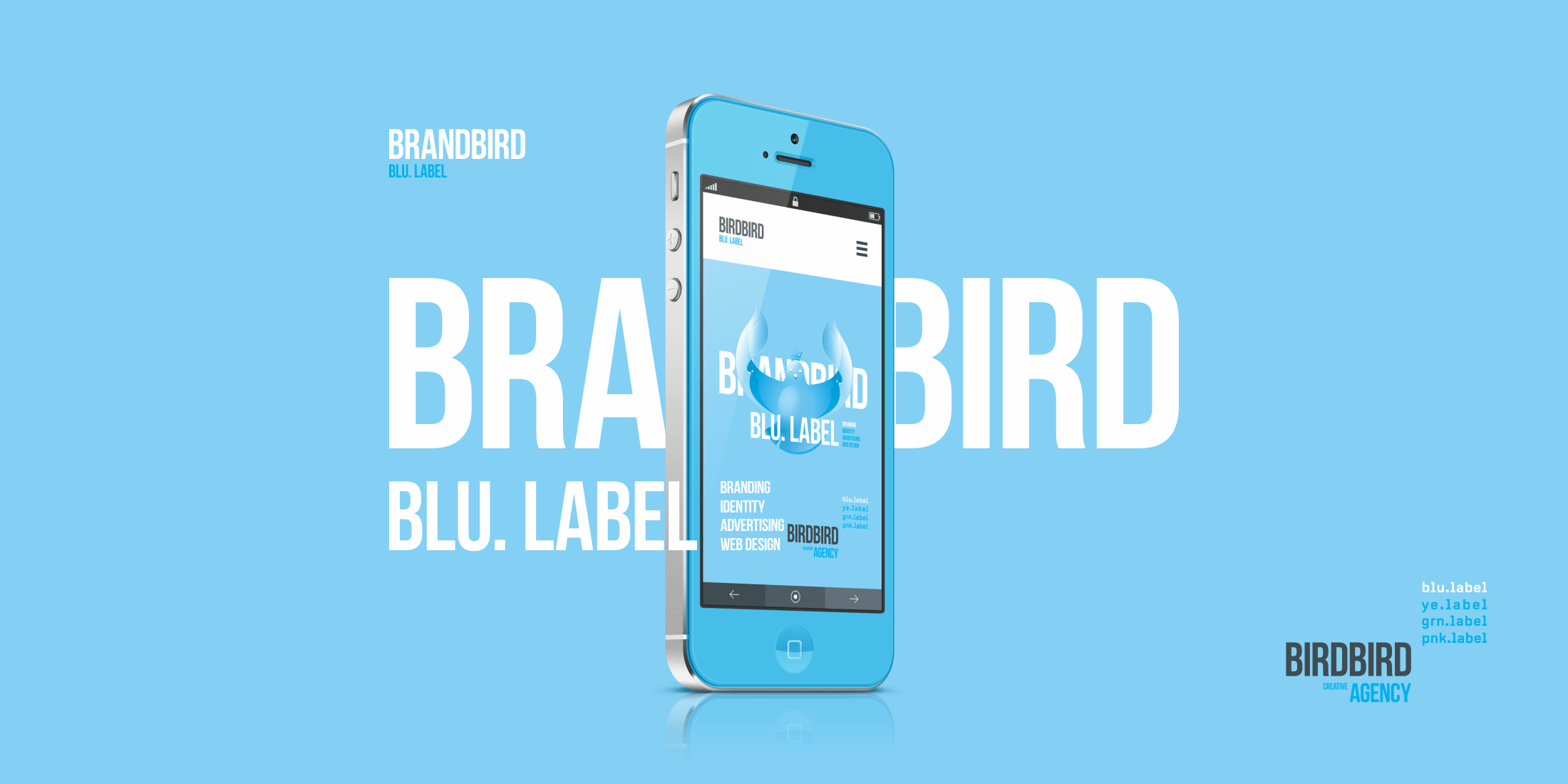
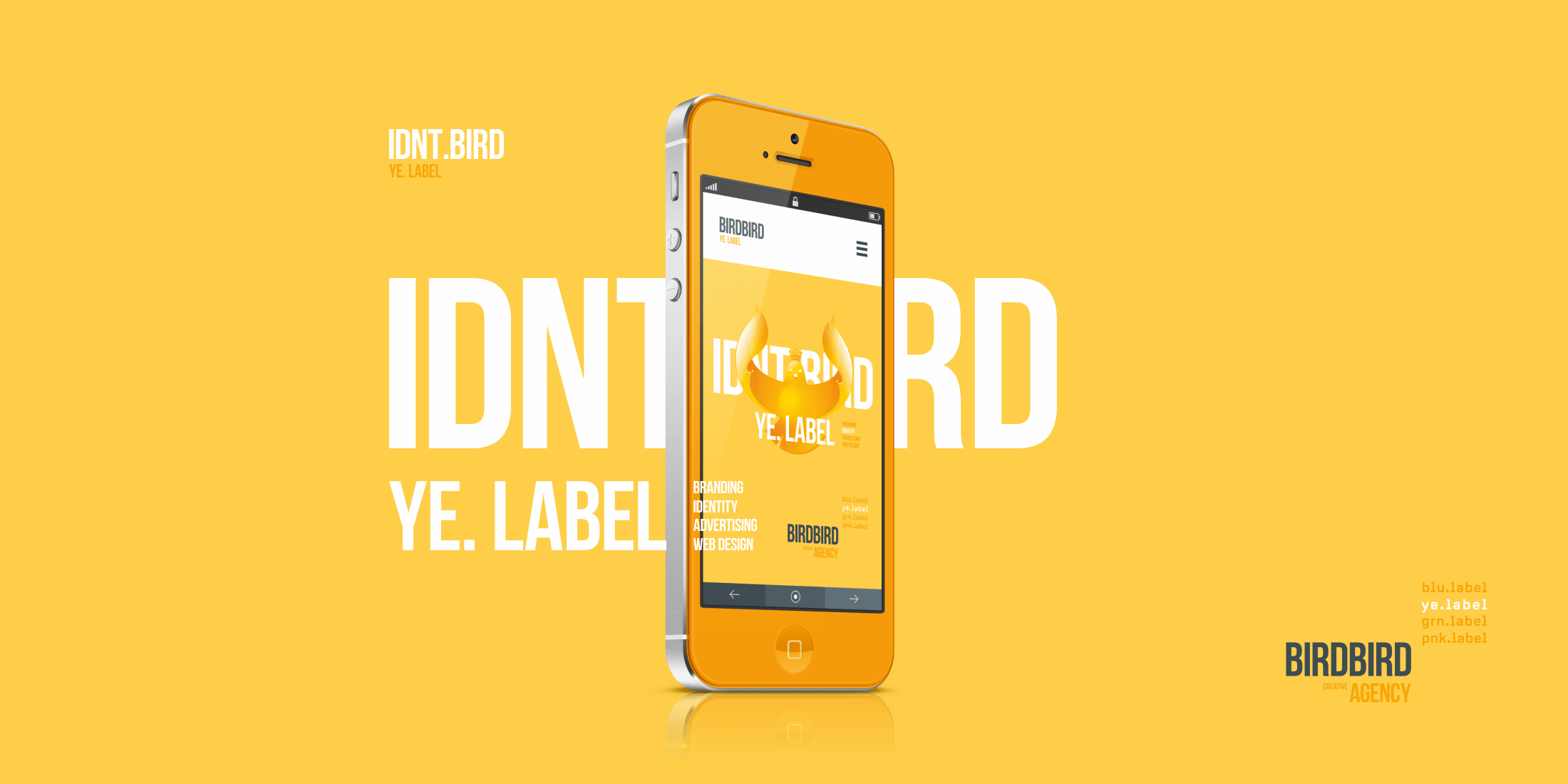
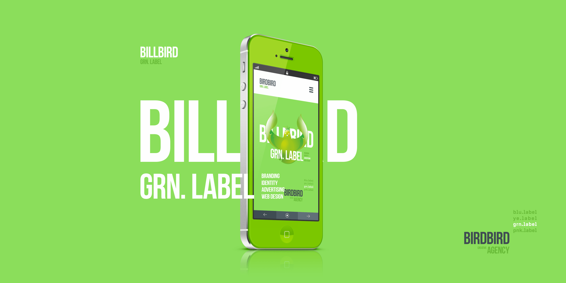
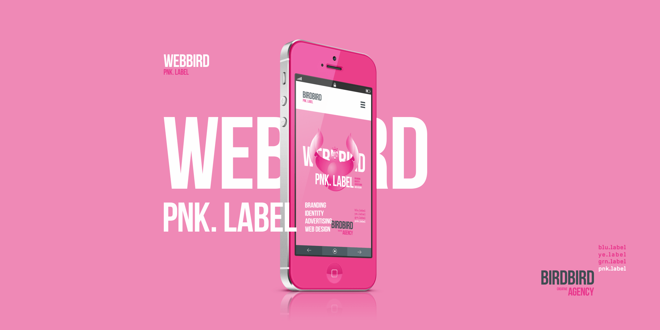
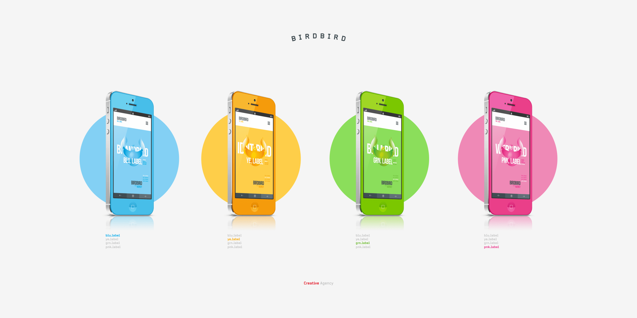
Eventually, we created a symbol that symbolizes the flight of thought, freedom of creativity, agility and flexibility of the company. Along with the concept of the sign and the evelopment of its color versions in each of the directions, we have displayed its interaction with minimal text content to give a greater idea of its flexibility and universality without the use of monochrome and abbreviated versions of the logo, despite its rather tricky color organization.
for watching!

